See also: print designs

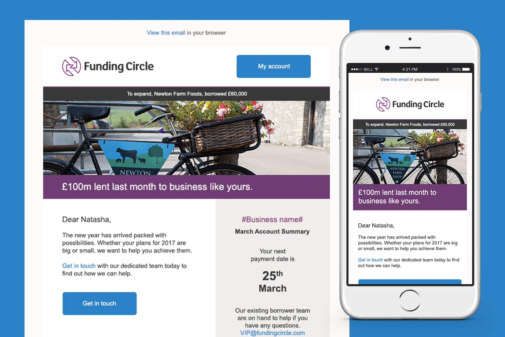
Modular and Responsive
Each content block was designed independently so they can be duplicated, reordered and reused with ease. They were built using HTML and CSS to be responsive, so they would scale down from desktop, to tablet and mobile, and be as compatible with as many OS, Browser and email/web clients as possible.

